family of 1 font from Corradine Fonts


A light hearted comic sansserif typeface inspired by a 1972 cartoon of the same name.
font family


Horror is, as its name suggests, a terribly great expressive typography to illustrate topics such as: nocture atmosphere, horror, zombie movie, hard rock, festival, halloween ... Accompanied many ornaments you can easily illustrate these themes.

Hopeless Heart isn't really all that hopeless! With its jumpy baseline and the different sized serifs, it’s a font full of fun and games, suitable for your next wedding invitation or love letter.
family of 1 font from Nick's Fonts

The raw emotional energy of German Expressionism is evident in this font, based on Judith Type, designed by C. H. Kleukens in 1923.

Hollenbeck JNL is the Art Deco, all-caps cousin of Jeff Levine’s Hallandale JNL typeface.
This version utilizes the thick-and-thin stroke weights so popular during the Art Deco era, while retaining the look of hand-lettered copy.
Best suited at larger point sizes, this font is a nice alternative to the over-used display faces reminiscent of that time period.
family of 1 font from Outside the Line
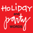

Handwritten or printed holiday and party words for all your flyers and party invitations.

Heruina oozes of feminine handwriting...comes with ligatures for both double letters and the most common letter combinations!
You will need to use OpenType supporting applications to use the autoligatures
family of 2 fonts from Ingrimayne Type
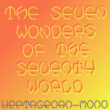

The world probably does not need a typeface with heptagonal letters, but I had a lot of fun designing it.

I had a chat recently with a customer who is a big fan of lettering from the psychedelic poster era.
The discussion got me thinking about poster lettering we hadn't yet made into fonts, and a particular sample from a Jimi Hendrix poster I had played around with but never finished making into a font.
So I went back to the drawing board and the result is the new Hendrix font. More…

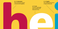
A modern neo-grotesque typeface. Having grown up in Sheffield and been completely immersed in the work of The Designers Republic I became very drawn to their treatment of Helvetica, especially the close tracking of the letter space. This visual investigation led me to the study of the font Hass Unica, a so called improvement to Helvetica. In order not to replicate and become a clone of Unica I redrew all the characters from scratch improving optical appearance, developing subtle corrections and reshaping individual letterforms. The result is a remixed neo-grotesque font that has strong general optical balance with great rhythm under close tracking. Details include 10 weights, an extended European character set, true italic, manually edited kerning and Euro symbol.
The Heinemann fonts were initially developed by the in-house design team at Heinemann educational publishing out of the necessity to find the perfect font for use in early primary reading books and literacy products.
Basic Heinemann is defined by longer ascenders and descenders, which help children to distinguish between letters; rounded edges on all letterforms, which help the reader focus on the individual letter shape; and modified characters (eg., a and g), which ensure instant recognition of letterforms.
More…
They have been tested in schools and learning institutions over an 8-year period, and they are a favorite for use in both print and electronic products. The modern, clean aesthetic of the fonts ensures that their use can spread beyond educational applications.

family of 2 fonts from Nick's Fonts
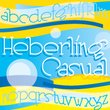

This delightfully playful font is based on a single-stroke pen font from the 1922 tome Heberling’s Basic Lettering, and elements of composition, color harmony, gilding, embossing-processes, etc. by Walter A. Heberling.

Glob is a multilanguage bubble-letter fonts!
Includes Italic, outline & rough version!
A whimsical semi-script typeface named Belcanto, designed by Edwin Sisty for Photolettering in the 1970s, provided the pattern for this typeface.
Elegant and engaging, this face is sure to put a smile on yours.
The PC PostScript, TrueType and OpenType versions contain the complete Latin language character set (Unicode 1252) plus support for Central European (Unicode 1250) languages as well.
font family


If you are searching for a stylish font to fit in a not very wide space, GL Tetuan is your font. Slab, modern but with a touch of oldstyle, compatible with many languages, including special characters and very nice ligatures. It includes Cyrilic, Georgian and Greek alphabets.
family of 7 fonts from Greater Albion Typefounders
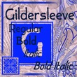

Gildersleeve is a new design in the spirit of the Arts and Crafts movement of the 1920s. Think of a hand-cut Roman display face, with loving care lavished over each serif and letterform.

The Gibson font family hits the right spot for many people and on many levels. It is a humanist sans serif typeface designed by eminent Canadian type designer Rod McDonald FGDC, and produced by Patrick Griffin and Kevin King of Canada Type, to honour John Gibson FGDC (1928-2011), Rod’s long-time friend and one of the original founders of the Society of Graphic Designers of Canada (GDC). More…
family of 6 fonts from PizzaDude.dk


Ghostboy is a hang-loose grafitti-like font inspired by some old (and long forgotten!) horror movie poster.
family of 4 fonts from James Todd
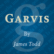

Inspired by both turn of the century neoclassical forms and Dutch Fleischmann Type, Garvis is designed to bring the character of those typefaces into more modern times by increasing the sturdiness of the forms without losing their character.