
Tuesday, October 29, 2013

Download Aachen Font Family
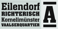
Letraset Type Director Colin Brignall designed Aachen Bold in the 1960’s to capitalize on the freedom that photosetting and dry transfer lettering offered. Aachen Bold features extra bold weight, contemporary lines and short serifs which allow the letters to be closely spaced.
A consistently popular typeface over the years for large headlines that need attention grabbing ‘muscle’.
Sunday, October 27, 2013

Design of this typography is based on straight strokes and standard curve strokes like those of test road tracks. Its design displays straight and balanced strokes showing strength and stability; and standardized curves show flexibility and smoothness, providing a relaxing reading. Therefore this font is ideal for corporate internal use, blogs, architecture webs, etc. A new good alternative for Arial and similar fonts. The most similar font to this one by comparing its style characteristics is Design Systems A-300.

In 1997, renowned lettering artist Julian Waters embodied his classical calligraphic roman capitals in a graceful typeface, aptly named Waters Titling. In 2001, the original design was enhanced and unified in the new OpenType format. More…

A titling font, combining caps inspired by the work of lettering artist Samuel Welo, and a lowercase based on the work of Lucian Bernhard.
Both versions of this font contain the Unicode 1252 (Latin) and Unicode 1250 (Central European) character sets, with localization for Romanian and Moldovan.